Academic Project | 2019
App Design01
App design with an identical visual system.
About This Project
This is an academic group project I made in Freshmen Year. The prompt was to create an App which solves a societal problem during the pandemic. On top of that, the app has to have a clear and outstanding visual system. My team chose to make a NYC metro app with strong visual elements. The app will alert users Covid cases in the surrounding area, while update people with train delays during the pandemic.

How did I approach
this project?
01 | Background Research
02 | Color Palette & Visual Elements
03 | User Flow Map
04 | Wireframes & Prototypes
Background Research
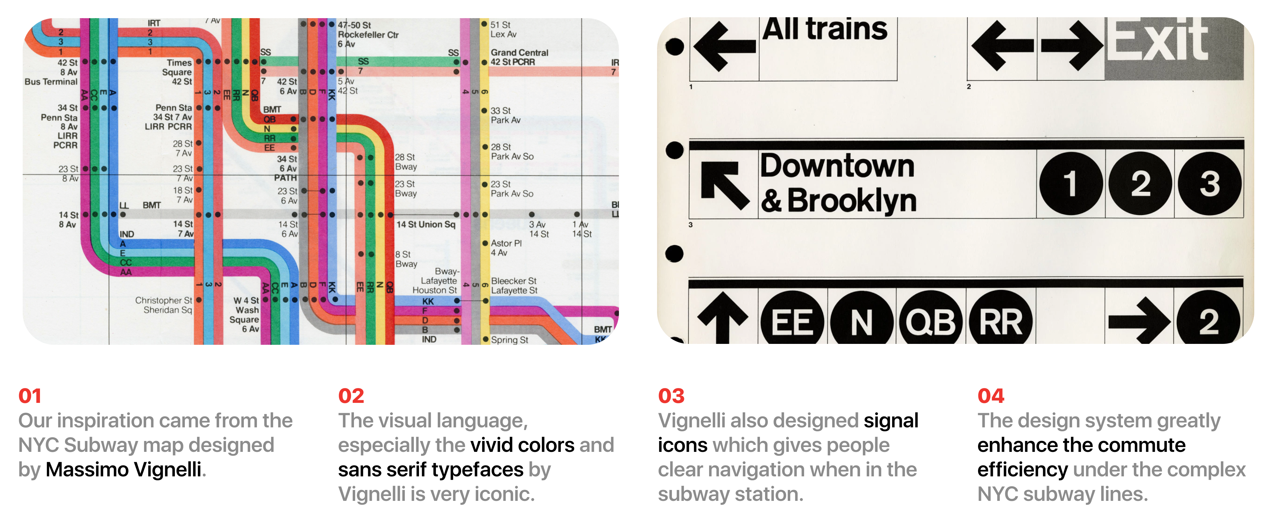
Since our App is a NYC Subway App, we took inspirations from the subway map design by Massimo Vignelli. We admire how Vignelli resolve the complexity of NYC subway lines, and helping people navigate a complicated infrastructure by giving them the right amount of information when they needed it.
We hope our App would do the same.

Visual Language Design
Color Palette
We decided to use the authentic MTA color for each subway lines. It may help our users to better connect the visual language of the app with traines they take.

Visual Language Design
Icon Elements
We decided to use the authentic MTA color for each subway lines. It may help our users to better connect the visual language of the app with traines they take.
