Intern Project | 2021
Smart Watch UX
User Interface Design
UX enhancements
for go-to-market wearable products.
About This Project
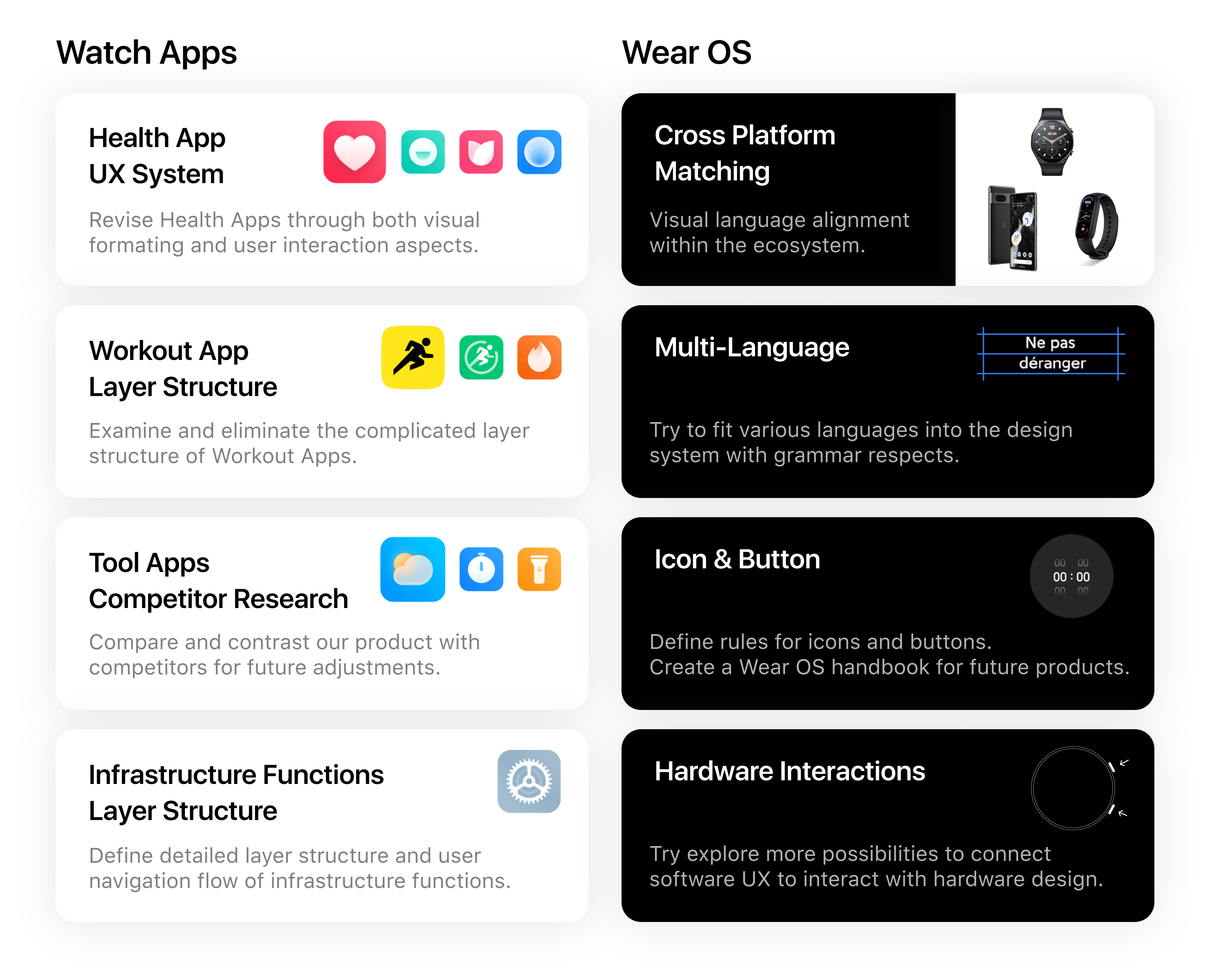
This project is from my 2021 summer internship at Xiaomi. I'm responsible to revise the Watch Apps and Wear OS system of Xiaomi Watch model S1. Here's a breakdown of my daily tasks.
How did I approach
this project?
01 | Competitor Research
02 | Analyze Existing Functions
03 | Layout Potential Changes
04 | Wireframes & Prototypes
05 | AB Testing & User Testing
06 | Multi-team Collaboration
Task 01
Health App
Revision
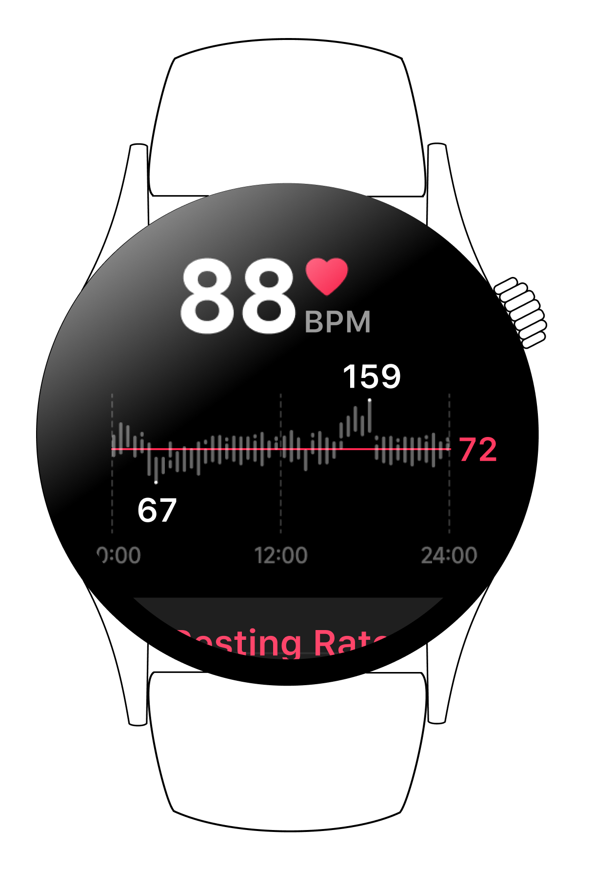
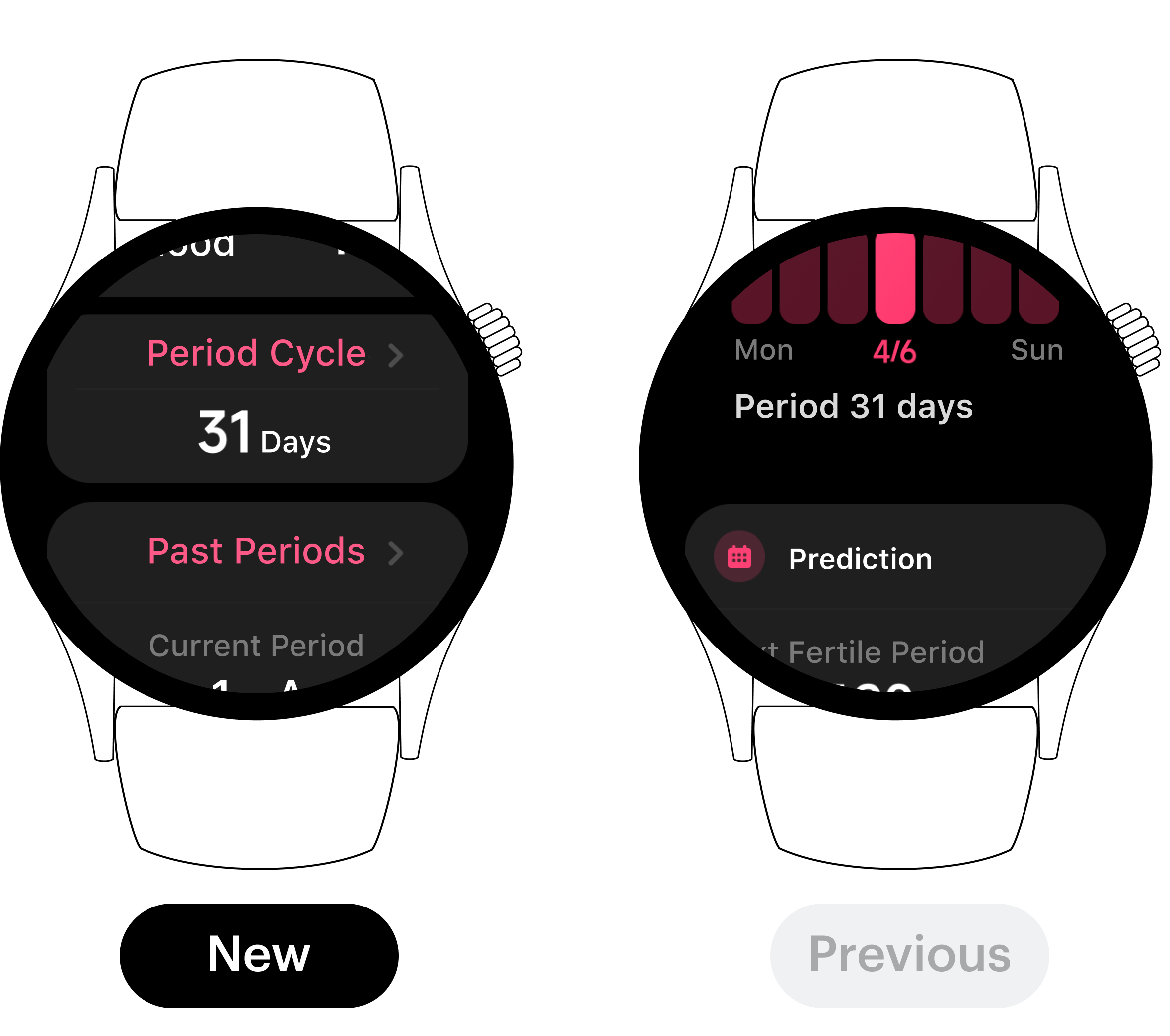
One of my major task was to revise the Health Apps. In this task, I examine the previous model and aimed to enhance formating & layouts and user interaction. Apps that I revised include Heart Rate, Stress Level, Breathe, and Cycle Tracking.

Mockup Comparison
Formating & Layout
What's New
Clear Hierarchy
Central Axisymmetric System
Important Info Emphasized
Clean & Unified Format
Easy Vertical Navigation
User Interaction
What's New
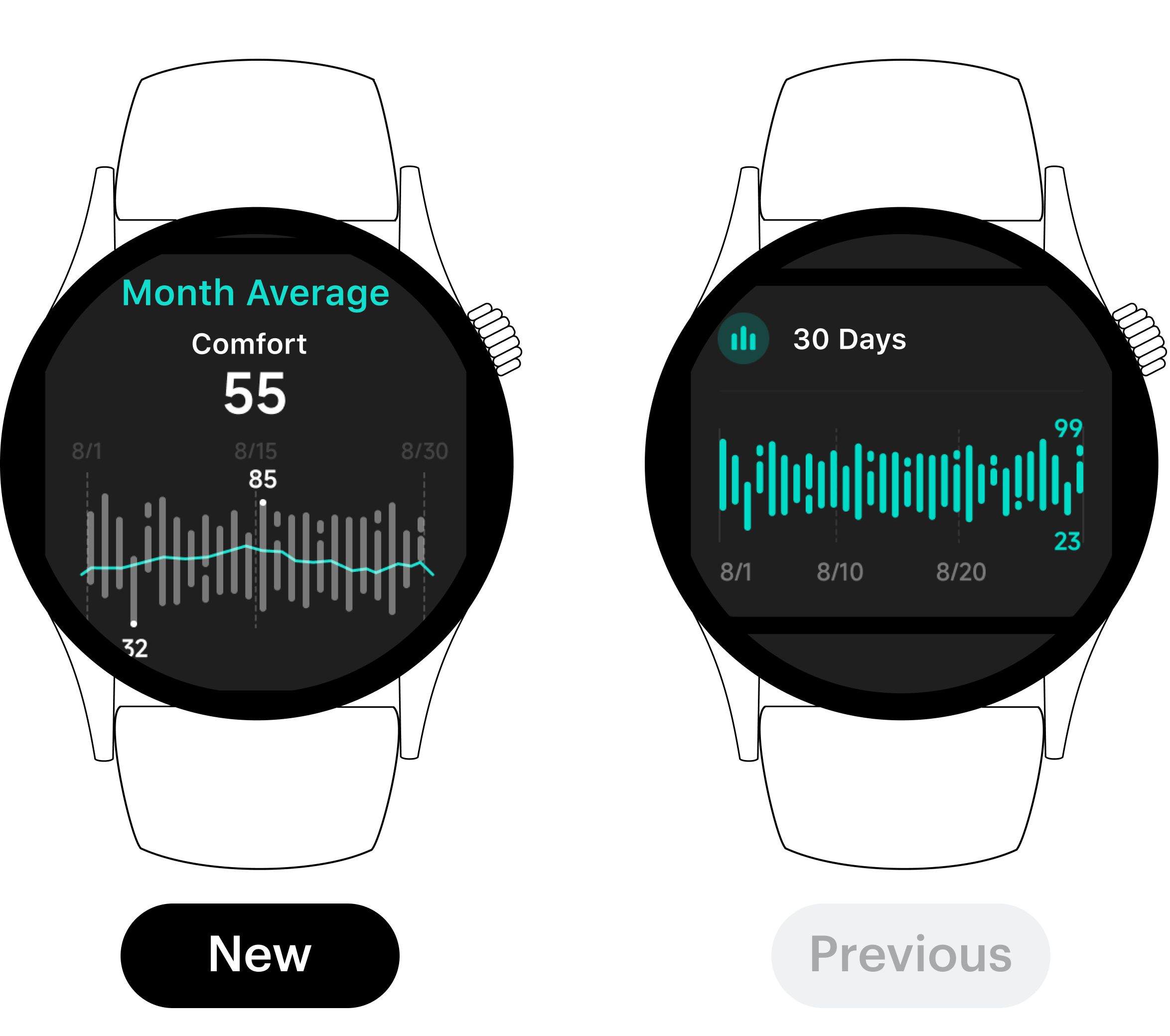
Readable Graphs
Interaction with Digital Crown
Numbers Take At One Glance
Visualized Curve and Climax
Improved Graph Accuracy
Task 02 | OS System
Wear OS
Structure Design
I’ve also explored the Mi Wear OS system structure during my intern experience.Here are some of the functions that I’ve explored and drew wireframes upon. Enhanced structures include Language Compatibility, Visual Layout Rules, Notifications, Cross-Devices Alignment, and Hardware Interactions.
01
Multi-Language
Compatibility
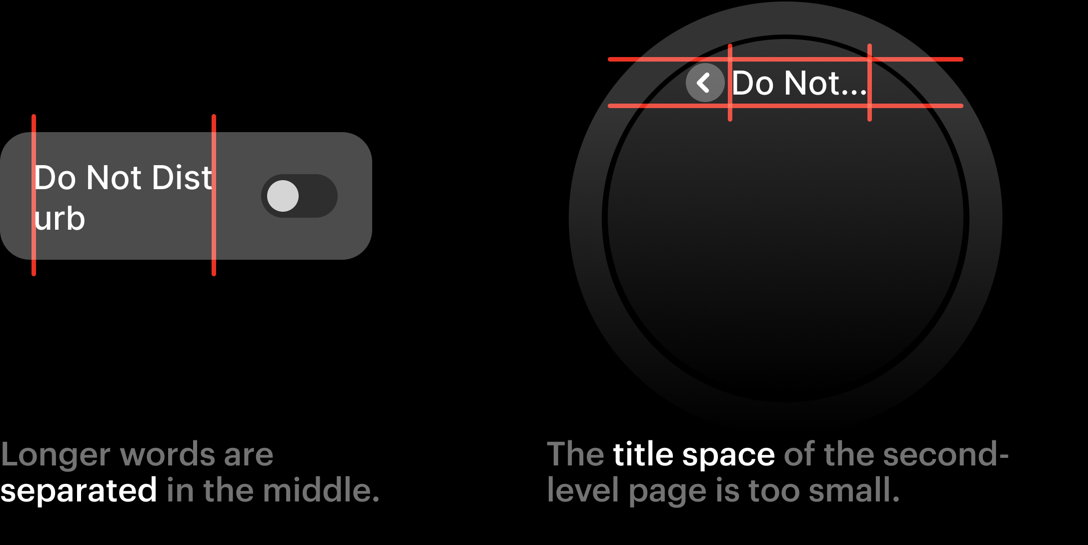
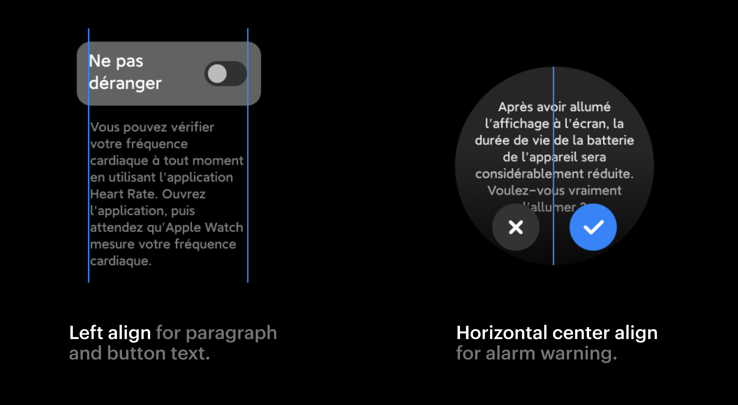
Xiaomi's original product design did not pay much attention to multi-language compatibility. Since we have users in Europe and Asia Pacific, it will help our oversea users better perceive our product features.
Previous Version
